Text and titles on their own lane
Most people watch video with the sound off. That makes text less of a decoration and more of a requirement — and it means where a caption sits, how long it stays and whether it survives a bright background are real editorial decisions, not afterthoughts.
In short
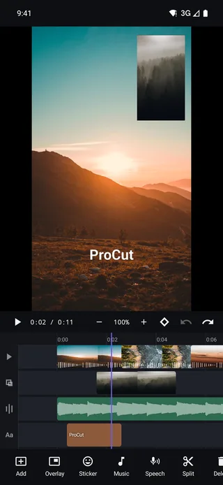
- Text lives on its own lane as a real clip — trimmable, keyframable, stackable, independent of the picture underneath.
- Styling covers font, size, colour, alignment, outline, shadow and background; outline plus shadow is what keeps text legible over moving footage.
- Entrances are built from keyframes, so a title can fade, slide or scale in exactly as fast as you want.
- Keep captions inside the safe area — roughly the middle 80% vertically — or the host app's own UI will cover them.
Text as a clip
Tap Add → text and a title clip appears on the text lane. From that point it behaves like every other clip in ProCut, which is the whole design:
- Trim either edge to change how long it stays on screen.
- Drag it along the lane, or across to a different one, to re-time it.
- Duplicate it to make the next caption with identical styling.
- Keyframe its position, scale, rotation and opacity.
- Stack several at once — a big title with a small subtitle under it is two clips on two rows.
Because the lane is free rather than magnetic, re-cutting the video underneath does not drag your captions around. That is exactly what you want while you are still changing the edit — and it is why titles should be the last pass, not the first.
Styling that stays readable
| Control | What it decides | Practical advice |
|---|---|---|
| Font | Personality | One font for the whole video, two at the absolute most |
| Size | Hierarchy | Assume a phone screen: bigger than looks right on a laptop |
| Colour | Contrast against footage | White or near-black; saturated colours vibrate on video |
| Alignment | Where lines sit relative to each other | Centre for titles, left for lists and lower thirds |
| Outline | Separation from the background | A thin dark outline is the single most useful control here |
| Shadow | Depth and edge definition | Soft and offset a little; hard shadows look dated |
| Background | A solid or translucent plate behind the text | For dense captions over busy footage |
The rule that matters more than any of the others: never put plain text straight onto moving footage. A shot that is dark for two seconds and bright for the next two will swallow white text halfway through. Outline, shadow or a background plate solves it, and costs nothing.
Test with the sound off, at arm's length, at half screen brightness. If a caption is still readable under those conditions it will survive anywhere.
The safe area, per platform
Every social platform draws its own interface on top of your video. Text that sits too low ends up behind a caption box, a username, or a row of buttons.
| Destination | Keep text away from | Rule of thumb |
|---|---|---|
| Vertical short-form | Bottom ~20% and right edge | Anchor captions in the middle third |
| Stories | Top and bottom ~15% | Centre band only |
| Landscape / long-form | Bottom ~10% | Standard lower-third position is fine |
| Square feed posts | Bottom edge | Play controls and text overlays sit low |
When in doubt, keep everything inside the middle 80% vertically — it survives every platform.
Timing: the two-and-a-half-second rule
A caption needs to be on screen long enough to read twice at a comfortable pace. For a short line that is around two and a half seconds; for anything longer, add roughly a third of a second per extra word.
The failure mode is always the same: text that is timed against how long you need to read a line you already wrote. You know what it says. Your viewer does not. When in doubt, hold it half a second longer than feels necessary.
Entrances with keyframes
Text uses the same keyframe system as everything else, so you build entrances rather than picking from a fixed list:
- Fade in — opacity 0 → 100 over six to eight frames.
- Pop — scale 92% → 100% with opacity, over five frames. Fast and confident.
- Slide — position offset to just off-frame, animating to rest. Pair it with a slide transition for a consistent direction of travel.
Keep entrances short. A title that takes a full second to arrive has spent a third of its life not being readable.
Four kinds of text and what each is for
- The hook. First one or two seconds, big, states what the video is. This is the one that decides whether anyone watches the rest.
- The lower third. A name and a role, held about four seconds, in the same position every time it appears.
- Captions. Short lines timed to speech, in the middle band, always with outline or a plate.
- The end card. One instruction, held long enough to act on — three seconds minimum.
Automatic captions
To be clear about what ships today: captions in ProCut are typed and timed by you. Automatic speech-to-text captioning is on the roadmap, not in the current build. If you want a voice on the timeline rather than a transcription of one, see text to speech, which is shipping.
Three sizes, and no more
Text stops working when every title is a different size. Decide three roles at the start of a project and reuse them:
| Role | Relative size | Used for | Typical count |
|---|---|---|---|
| Headline | Largest | The hook, the punchline, the offer | 1–2 per video |
| Label | Medium | Names, places, prices, step numbers | As many as needed |
| Caption | Smallest | Spoken words, disclaimers, sources | Continuous, or none |
The same applies to colour and font. One typeface with two weights looks intentional; four typefaces look like a first draft. If you need emphasis, change size or weight before you change family.
Writing the words, not just styling them
Most weak titles are a writing problem wearing a design problem's clothes. Before you touch the font, cut the line down.
- Delete the setup. "Here's how to make the perfect coffee" becomes "The perfect coffee". The viewer can see it is a how-to.
- Delete the qualifiers. Really, actually, basically, just — none of them survive a title.
- Do not caption the picture. If the shot shows a beach, the title should not say "the beach". Text is most valuable saying what the image cannot.
- Numbers earn their space. "50% off", "3 ingredients", "2 minutes" are read instantly and remembered; adjectives are not.
- One idea per title. If a line has an "and" in it, it is usually two titles, or one title and something to cut.
A practical test: cover the video and read the titles alone in order. If they make sense as a list, the text is doing its job. If they read as fragments of a sentence someone is speaking, they belong in the narration instead.
Frequently asked questions
Can I put more than one text clip on screen at once?
Yes. Text clips stack — a headline and a subtitle are two clips overlapping in time, each styled and positioned independently.
Does ProCut generate captions automatically from speech?
Not in the shipping build. Automatic captions are on the roadmap; today you type text clips and time them on the text lane.
Will my titles move if I re-cut the video?
No. The text lane is free rather than magnetic, so titles stay at the times you set them. That is why it is worth adding text after the cut is locked.
Readable with the sound off.
Text clips with outline, shadow and keyframed entrances — on a lane of their own, free, with no watermark.
Keep reading
Keyframes and Ken Burns moves
Scale, position, rotation, opacity and volume can all animate. Set two points, and the engine interpolates every frame in between.
Text to speech voiceover
Six named voices plus your device's installed voices, pitch and reading speed controls, preview before you commit, then straight onto the audio lane.
Stickers and 3D emoji
Faces, Love, Party, Animals, Food and Nature — dropped onto their own lane, then scaled, rotated and keyframed like anything else.